 |
| Source: Asbury Park Press |
Aside from the physical drama and the halftime theatrics, the Super Bowl provides prime fodder for data analytics. The enormous volume of communication and marketing around this shared cultural moment offers a case study for exploring numbers and significance.
These days, graphs are no longer the sole purview of math class. This fall, for example, we spent a “math week” in social studies talking about how historians incorporate statistics and charts in probing the details behind pivotal events. Similarly, the Super Bowl bridges academic disciplines as an appealing touchstone for students to get excited about analytical reasoning and data design. That’s how right-brained and left-brained mindsets can merge perfectly in a contemporary STEAM study.
Some examples of lessons and visual aids that use graphs and charts include:
- Is There A Visual Thinking App? Charts, Graphs, & The 1:1 Classroom
- The School Of Big Data - Choosing The Right Graph
- I Love Charts - Discovering Stories Hidden In Numbers
- A Taxonomy Of Graphs
 |
| Source: Yellowfin |
The emphasis here is on the visual presentation of numerical sets. Graphic literacy (or “graphicacy”) means that learners can “read” the grammar of lines and bars. Understanding trends and anomalies are key skills in interpreting mathematical and scientific figures.
As every educational institution searches for ways to blend STEAM proficiencies into the curriculum, the pop draw of the Super Bowl can be just the ticket to grab kids’ attentions in discovering the day’s dynamic details. Any of the tables or diagrams below would be terrific examples to show on Monday in kicking off a week of visual STEAM activities. The logical reasoning of numbers meets the illustrative narrative of the liberal arts:
 |
| Source: The New York Times |
Super Bowl ads often get the most attention from both football diehards and passing revelers alike. This interactive tool from the New York Times allows students to compare a timeline of percentages as they parse the media blitz across the years.
 |
| Source: Yellowfin |
The media literacy component of Super Bowl mayhem cannot be overlooked. Many avenues exist for teachers to guide students in realizing the emotional tug of advertising during this high profile event. Yellowfin has designed an easily understood graph of Super Bowl ad prices to engage any student.
 |
| Source: Yellowfin |
For aficionados of the sport itself, Yellowfin has assembled a horizontal bar chart of MVP winners by position. The results are familiar enough to let the content drive the comprehension. In other words, even the youngest mathematicians can expect QBs to win awards, and thus the extended blue bar becomes a visual signifier for their predictions.
 |
| Source: Yellowfin |
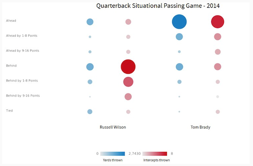
For strategists of team offenses, bubble graphs can blend with traditional tables to illuminate the choices of quarterbacks in certain situations.
For other Super Bowl educational resources, we recommend these posts:


