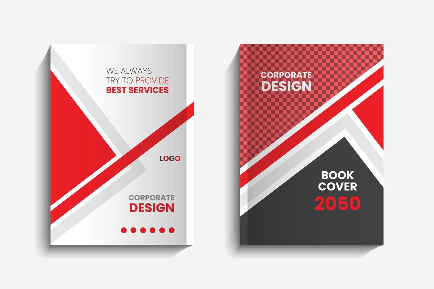
In the realm of literature, a book's cover serves as its first impression, the initial gateway to the world within its pages. A well-designed book cover has the power to captivate, evoke emotions, and provide a glimpse into the narrative it envelopes. Book cover design is an intricate blend of artistry and psychology, a creative endeavor that not only entices potential readers but also communicates the essence of the content within. This essay explores the nuances of book cover design, delving into the elements that make a cover successful and the psychological factors that influence a reader's perception.
The Visual Language of Book Covers
Book covers are visual ambassadors, bridging the gap between the author's imagination and the reader's curiosity. They employ a visual language that conveys crucial elements of the book, including its genre, tone, and themes. Through carefully chosen imagery, typography, color palettes, and layout, a cover designer communicates information that guides potential readers toward an understanding of what lies between the pages.
Imagery: The Heartbeat of the Cover
Imagery is the soul of a book cover. A well-selected image can encapsulate the essence of the narrative, evoke emotions, and create an instant connection with the audience. From symbolic illustrations to evocative photographs, imagery is a storyteller in its own right. For instance, a crime thriller might feature a shadowy figure or a cityscape at dusk, while a romance novel might showcase an intimate moment or a bouquet of roses. The choice of imagery sets the mood and resonates with the target readers.
Typography: Shaping Perception
Typography is an art form that extends beyond legibility. The fonts chosen for a book cover play a pivotal role in conveying the book's personality. Bold, elegant fonts might signal historical fiction, while playful, handwritten fonts could indicate a lighthearted tale. The arrangement of text also holds significance, with titles and author names commanding prime real estate. The interplay of fonts, sizes, and placements guides the reader's eye, directing their attention and emphasizing key information.
Colors: The Palette of Emotion
Colors wield an emotional influence that transcends language barriers. The color palette of a book cover speaks to the reader's emotions and expectations. Warm hues like reds and oranges evoke passion and intensity, while cooler tones like blues and greens evoke calm and intrigue. The harmonious blending of colors creates visual harmony, drawing the reader into the cover's world and aligning their emotions with the book's themes.
Psychology of Book Cover Design
Book cover design is not merely an exercise in aesthetics; it's rooted in psychology. The cover serves as a trigger for a reader's cognitive and emotional response, influencing their decision to pick up the book or explore further. The "mere exposure effect" suggests that people tend to develop a preference for things they encounter frequently. This principle underscores the importance of creating a memorable cover design that becomes etched in a reader's mind.
Furthermore, the brain processes visuals faster than text. This insight underscores the significance of compelling imagery in capturing a reader's attention amidst a sea of choices. Emotions triggered by a cover, whether curiosity, nostalgia, or excitement, can influence a reader's perception of the book's potential value.
Conclusion
In the tapestry of literature, book cover design is a vital thread, weaving together creativity, psychology, and communication. A well-crafted cover extends an invitation to readers, promising an immersive journey within its pages. It encapsulates the essence of the author's vision while resonating with the reader's emotions and expectations. As technology continues to reshape the publishing landscape, the art and psychology of book cover design remain steadfast in their ability to spark intrigue, kindle emotions, and beckon readers to embark on literary adventures.


